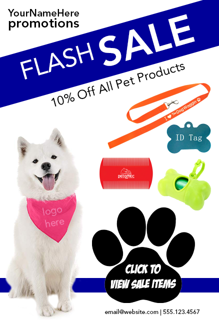
Last month I reviewed the five key elements that you should be incorporating into your flyers. If you missed it, take a moment to read it before continuing with this article (it’s a quick read, I promise). This month I’m going to take it a step further and share three ways you can use these elements to simplify your flyer while increasing impact.
According to Adobe, “The concept of the flyer … remains one of our most effective and versatile forms of communication. … At its most basic, the flyer is a call to action, a short notice designed to grab attention and give essential info in order to inspire and facilitate follow-up activity.”
So, how do we grab attention, give essential information, and facilitate follow-up activity in a world that’s oversaturated with advertising? That’s easy, make sure your flyers are visually striking by using a layout that is deliberate.
What the heck am I talking about? Every piece you put on your flyer should be thought through so you’re not wasting your viewer’s attention and causing them to click off to the next email or social post. If you follow these three steps, your flyers will not only be simplified but impactful.
- Every decision you make with the design of your flyer should support and enhance your message. Don’t overload your flyer with information, remember, flyers are meant to be bite-sized teasers to pull the viewer to your desired destination.
Embrace negative space. This gives the viewer a visual break so they aren’t overwhelmed when viewing your flyer.
Use color to work in your favor, to help convey a feeling. 99designs has a great article explaining the meanings and art of using color symbolism.

Utilize a supporting image or graphic to help define the overall theme/message of your flyer. Providing visual cues helps increase comprehension and retention while supporting your Content.

Incorporate visual hierarchy. This is Graphic Design 101. Organize the content of your flyer by importance. The most basic form of this is a “lateral layout” - the most important information starts at the top and works its way down. If you don’t want to be “basic”, try playing with different fonts and scales, the larger the information the more important it is. This is a great way to organize your Heading, Subheading, Contact Information, and Call-To-Action.

By utilizing these three simple steps, you can simplify your flyers while increasing their impact in no time.
Come back next month for tips on how to find visual inspiration.
Jessica is the Art Director at PromoCorner and has been in the promotional products industry since 2010. With a degree in Graphic Design, she has been working in Marketing since 2006 creating advertising of all sizes; from social posts to billboards. Jessica shares her passion for design in her monthly blog, Designer Patch. She can be reached at
jessica@promocorner.com.