Why do people care what Pantone’s Color of the Year is? Because people love trends and this is a trend that can be utilized in so many markets: fashion, graphic design, beauty, and even promo. But the 2026 pick - Cloud Dancer - has caused a divide, many viewing it as uninspired and boring especially after all the colors we’ve had since the Color of the Year’s creation in 1999. But I think you should give it a chance.
When I first went to Pantone’s website to see when they would be announcing the Color of the Year, I noticed they were running a poll asking which color family people expected their pick to come from. I thought it was strange that the options included black and white. So when Cloud Dancer was chosen, I can’t say I was entirely surprised but I was curious how Pantone arrived at their final decision.
Let’s take a closer look at what goes into picking a color. Pantone started the Color of the Year as a way to “engage the design community and color enthusiasts around the world in a conversation around color.” To do this, the Pantone Color Institute has compiled color experts - many of whom own their own design studios and contribute to key influential global trend forecasts, work with clients advising color choices for product or brand visual identity, and even teach classes on color - to scour the world for color influences (artists, fashion, travel, entertainment, materials, textures, etc). “No one on our global team comes to any Pantone Color of the Year discussion with a commercial agenda or inserts their personal preferences. Instead, we each approach our Pantone Color of the Year color selection in a very pure way. As we like to say, ‘we love all of our colors equally.’” This discussion is one long, flowing conversation. “We discuss our color psychology and color trend research looking to connect the mood of the global zeitgeist with the corresponding color family. From there, we drill down further to identify the exact right shade.”
“The goal of the program is to help companies and consumers better understand the power color can have. We want to teach them how to leverage color’s power and expressiveness to influence perception — whether it be to create a more successful design strategy that will increase consumer engagement, or to use it to better showcase your own personal identity.” - Laura Pressman, Vice President of the Pantone Color Institute
Not everything needs to be drenched in color, there is an elegance in utilizing white. Think of a button up shirt or plain white tee, they’re classics for a reason. White illuminates, providing a bright visual feedback and any colors used with it instantly pop. Take a look at these examples from Paris, New York, and London Fashion Week for Spring/Summer 2026.
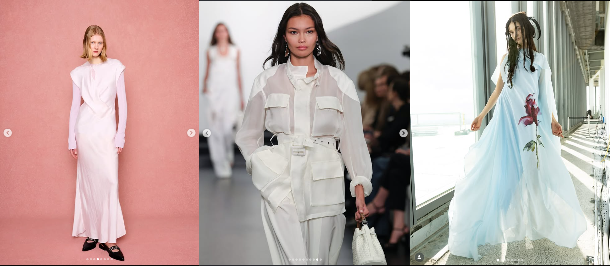
[image source: Paris Fashion Week, New York Fashion Week, London Fashion Week on Instagram]
Nehera’s white dress takes on a hue of pink from the background. Ralph Lauren uses various textures in an all white outfit to create depth. Marques Almeida makes their floral print stand out by using a solid white background to provide the purest colors. None of these are boring.
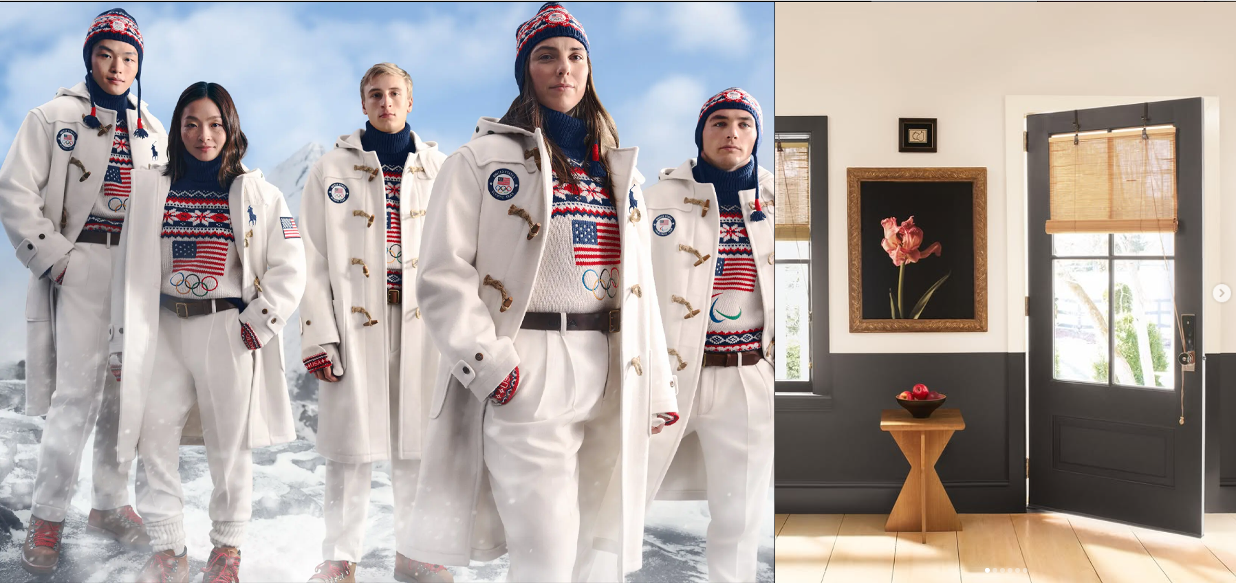
[image source: Ralph Lauren, Benjamin Moore]
Ralph Lauren chose to use white as the primary color for Team USA’s 2026 Winter Olympics Opening Ceremonies uniforms allowing the red and blue to work together in an intricate pattern without causing tension with the colors in the Olympic Rings. Similarly, Benjamin Moore paired Swiss Coffee with their color of the year, Silhouette (a charcoal brown), to provide a balanced contrast while letting more decorative details shine.
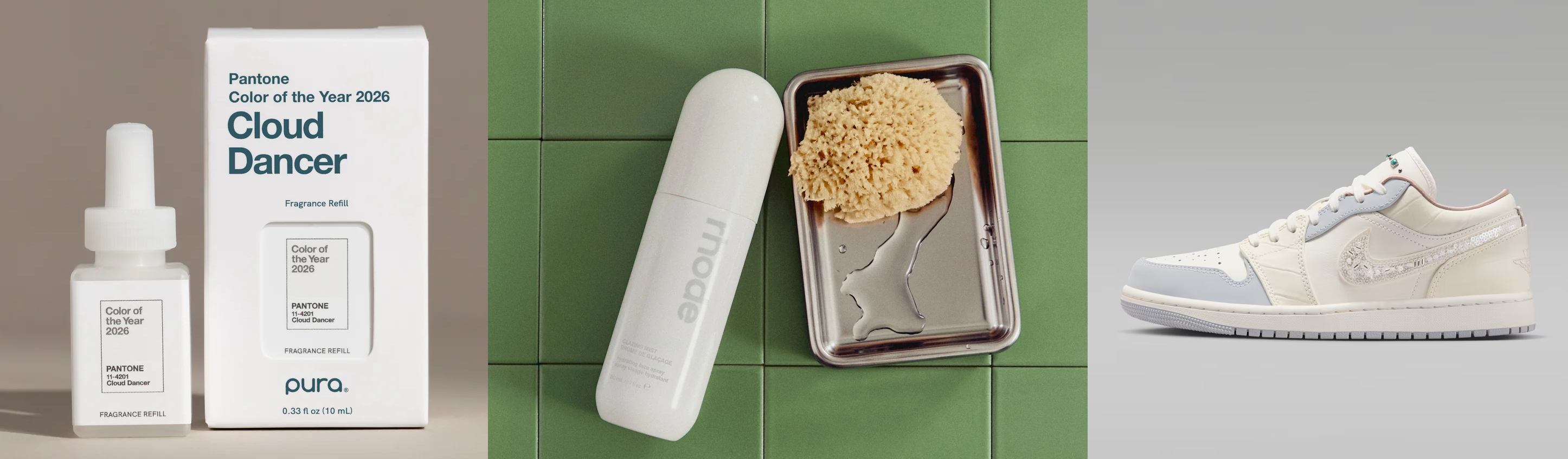
[image source: Pantone, Rhode, Nike]
The pura® packaging is a great example of letting typography lead. The clean packaging, use of hierarchy, and a bold type elevate the simple design. Rhode used a complementing hue of green as the background allowing the white packaging to become the focal point. Nike combines various shades of white and materials to create an eye-catching sneaker.
As mentioned in my 2026 Graphic Design Trends blog, we’re going to see a shift to minimalism in design and Cloud Dancer leans into this nicely. Its pureness “invites viewers to focus on shape, movement and emotion.” (pronthego.com) Look at that, movement, another 2026 design trend. If you take a page from Rhode’s book, pair Cloud Dancer with a staple color to create a contrast that feels intentionally modern. It’s also a perfect color to complement unique typography, gradients, and overlays adding more visual interest to your designs. As for promotional products, white on white embroidery will look timeless and elegant, and playing with textures will bring a modern and artistic feel to your brand.
White can be a moment, just like purple or green or black. But if you still need some inspiration on how you can work with Cloud Dancer, Pantone has created
seven color palettes to help spark your creativity.

Jessica is the Art Director at PromoCorner and has been in the promotional products industry since 2010. With a degree in Graphic Design, she has been working in Marketing since 2006 creating advertising of all sizes; from social posts to billboards. Jessica shares her passion for design in her monthly blog, Designer Patch. She can be reached at
jessica@promocorner.com.