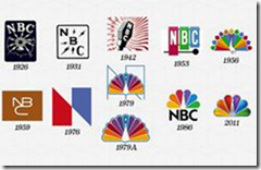
Take a moment if you will to Google some of the Fortune 500 companies and their transition of the years to re-brand their company and their look – a fresh face if you will. For instance, look at how NBC has transitioned their brand over the years.
 All companies do this and you may wonder why. It’s to stay relevant, fresh and current – is it time for you to do the same? Over the years, my personal brand marketing company has gone through four different reiterations over an 11-year span.
Take a quick look at what studies have uncovered about the use of colors in branding
• Colors influence 60 to 80 percent of a person’s decision when purchasing
• Color is the initial impression of your brand
• With new technology it is easier than ever to use color in your brand.
The 100 World’s Top Brands use these colors:
• Red – 29%
• Blue – 33%
• Black or a gradation of black – 28%
• Yellow or Gold – 13%
Additionally,
• 95% use only one or two colors
• 41% use text only
• 9% don’t feature the company name at all (see the current NBC logo above)
Colors can be separated into two categories, warm and cold. Warm colors invoke energy while cold colors lend themselves to security, soothing and calmness.
• Red – warm: this color is meant to excite, raise your heart rate and create movement. The qualities red exudes are: aggression, energy, provocative, catching attention and creates a sense of urgency.
• Purple – cold: Is a very mysterious color and has a unique richness. The qualities purple exudes are: spirituality, mystery, royalty, sophistication, old school
• Blue – cold: variations of this color are the most used of the brand colors. This color is soothing and calming. The qualities blue exudes are: trustworthiness, dependability, responsibility, security.
• Green – cold: While the spectrum of colors are great with the color green; dark green color is associated with wealth and affluence, while lighter greens tie with peace and serenity. The color green is the easiest color for the eye to process. The qualities green exudes are: wealth, health, prestige, and serenity
• Yellow – warm: represents hope and is used to highlight and catch someone’s eye and grabs attention. The qualities yellow exudes are: motivation, creativity, upbeat and positive.
• Orange – warm: a blend of both yellow and red give this rich color a unique combination of being bold and cheerful that is loaded with life – orange creates a call to action. The qualities orange exudes are: vibrant, playful, fun and exciting.
• Brown – warm: a back to basics, back to the earth expression and definitely speaks to strength, long-standing and power. The qualities brown exudes are: simplicity, natural, grounding, long-lasting.
• Black – warm: Classic and classy, you might notice that many high-end, expensive cars use black as one of their fleet colors. The qualities black exudes are: expensive, high value, longevity, classy and sophisticated.
• White – cold: The color white represents a clean and pure. Think about the different things that are white, that represent these thoughts, lab coat, sheets, and doves. The qualities white exudes are: nobility, fresh, clean, smooth
Believe it or not we as humans are subliminally affected by color choice for brands. Your brand IS a product so it is very important when choosing colors for your brand or re-brand that you take time to be selective and think through the process. Everything you use to market your brand should filter through that process: website, social media, print collateral, and marketing collateral. ALL should be consistent and reflect the image you want people to remember and associate with your company.
Something as simple as a new look, logo, tagline may just be the catalyst that will jump start your brand. If it's good enough for McDonalds, Apple, Starbucks and others, perhaps it’s good for you. Take a moment to review your brand for consistency, clarity and relevance, it’s not too late; and with today’s technology it's easier than ever to make the transition.
The first 10 readers who would like me to review your brand, logo and collateral, drop me a line at cquicksell@ipromoteu.com and I'd be happy to offer you my thoughts at no charge.
Until next month, continued good health and good selling.
Cliff Quicksell, MAS, has been involved in the promotional marketing industry for over 30 years. He is the recipient of over 25 international sales and marketing awards for innovation, creativity and his contributions to the industry. He can be reached at cquicksell@ipromoteu.com or 301-717-0615.