With concert season in full swing, I want to talk about concert merch design. The good, the bad, and some tips. What I discuss below is my POV as a Graphic Designer and not a dig against anyone’s taste in music or merch style.
Time and again my friends and I have seen music merch drop and say, “That could’ve been so much cooler!” or “They missed out on an opportunity to do (X,Y,Z).” Most recently my best friend (a Graphic Designer & Photographer that worked in the promo industry and music marketing industry for many years) sent me a screenshot of Justin Timberlake’s new merch with the text, “all of this is yawn-tacular”.

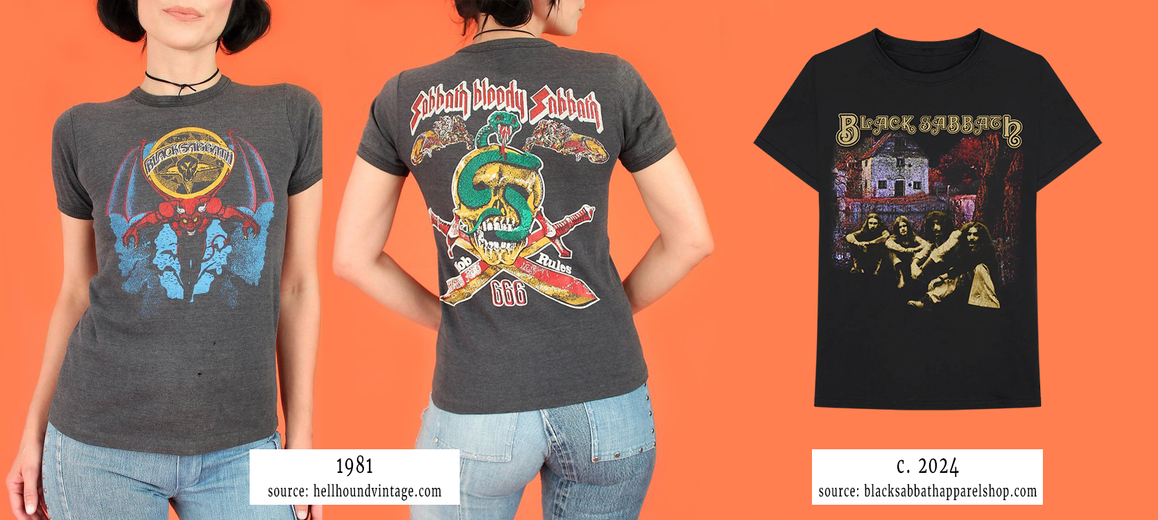
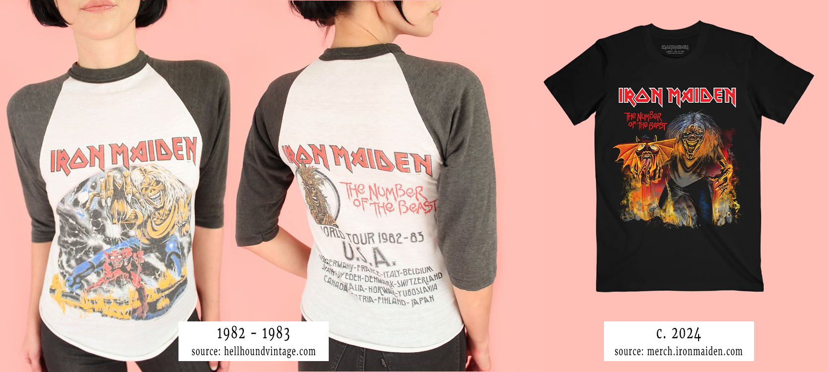
A lot of music merch has gone the route of slapping a photo or the most basic text on a shirt and calling it a day. Where’s the creativity? Where’s the design? “It feels more like (bad) advertising than another artistic medium.” - Casey Gallenberger of indievisionmusic.com
So how did we go from fluid designs to constricted ones?


Aimee Stevland, designer/illustrator to some big names and former Creative Director in the music merchandising world states, “These days, print production skills aren’t at the forefront of content creation, so most newer designers are primarily designing for digital content created with pixels that live in a floating box. However, shirts and other products are 3-dimensional, tangible canvases that require “out of the box” thinking and understanding about how these items actually get produced and used. Most apparel is mocked up on a flat surface, but it ultimately has to flow across a human form.” (linkedin.com)
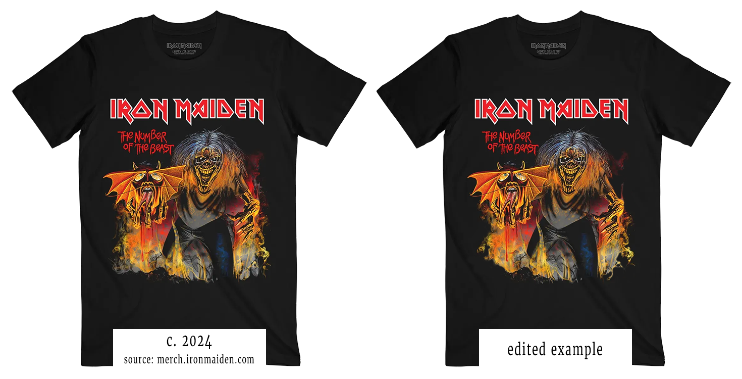
Yes, imprint areas are “restricting”, but don’t think of them as borders. You can create internal edges to increase visual interest and utilize curves and negative space to make the design flow and not feel boxy. The 2024 Iron Maiden artwork almost provided a fluid design with the “bat” wing and Eddie The Head’s arm extending away from its body, but then they boxed themselves in with the background. Instead of squaring off the edges they could have depicted the smoke in its natural form, flowy.

But the blame doesn’t always lie on the designer, artists and their labels can be too involved or not involved enough. “Sometimes bands and artists forget the impact that merch can have (both on the fans and their back pocket) and therefore forget to make their merch special.” - horusmusic.global
What can be done to help improve merch?
Get feedback! Who knows what they want more than those actually buying and using the merch. Send out surveys via newsletters, house them in the members only portal of the website, or ask concertgoers in person.
You can also help clients run a contest to have fans design merch. Being a fan of Tony Lucca, the artist of this design created something he would buy and it proved to be a hit, selling out. To capitalize on its popularity, Lucca did a reorder and added the shirt to his online store (in addition to his shows).

Educate yourself so you can educate your clients. Learn the different weights of t-shirts and how they feel. What do various print methods look like on them? How do they stand up after numerous washes?
Talk with your apparel decorator about various printing methods to provide unique looks, ones that offer the best feel, and their levels of durability (ex. vintage fading vs thick ink cracking after one wash).
Remember, “A well designed shirt not only showcases your band’s aesthetic but also serves as a walking advertisement…” - Ben Buzzard of extremescreenprints.com
Jessica is the Art Director at PromoCorner and has been in the promotional products industry since 2010. With a degree in Graphic Design, she has been working in Marketing since 2006 creating advertising of all sizes; from social posts to billboards. Jessica shares her passion for design in her monthly blog, Designer Patch. She can be reached at
jessica@promocorner.com.