We have our checklist of things to include in our flyers; product image, name, number, pricing, setup charges, run charges, and a catchy header. But what about a call-to-action? Never assume the recipient of the flyer will follow-up with you after they view your email. “Demand” an action, tell them what to do.
If you’re not familiar with a call-to-action (CTA), it’s a part of an advertisement that tells the audience what they should be doing with your flyer and beyond.
Do you want your customer to view more products on your website?
Do you want your customer to register for an event?
Do you want your customer to flip through your digital catalog?
Do you want your customer to contact you for more information?
The list is virtually endless.
Phil Martin, National Sales Manager at Warwick Publishing, shared some examples of how they use CTAs to direct their customers. "At Warwick we use 'Click Here for a Free Sample' which links to our free sample form, another says 'Click to View the Full Line' which links to our full line PageFlip catalog, and then another link that goes to the product we are promoting. This not only gives us a better chance to further engage the viewer and show them more of our line, but it also provides us with a better idea of what type of flyer works best because we are able to track the click-throughs and impressions."
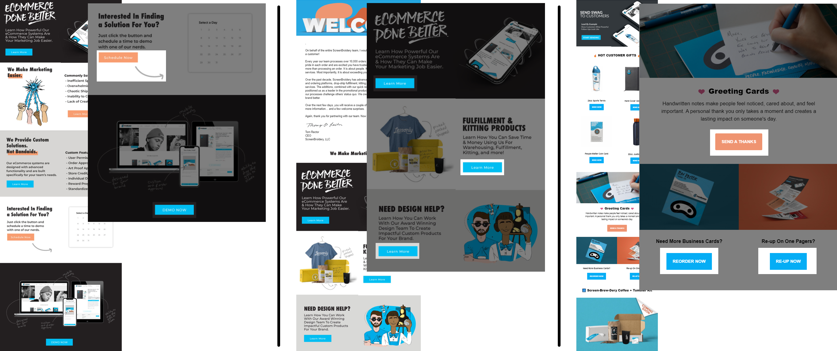
CTAs aren't just for Suppliers! I chatted with Thomas Rector, CEO of ScreenBroidery, to get an inside look at how a Distributor is using them. "All of our marketing is designed with some form of a call-to-action or intended purpose. A lot of thought goes into our marketing efforts, and it always begins with answering the question, 'What do we want our customer to do after they receive our message?'. Simply 'placing an order' is the easiest answer and usually the most difficult action to achieve.
For email blasts, the purpose is typically engaging; click a link to learn more, to see examples, to read case studies, or in some cases to see pricing. Our purpose is not to close a deal through the marketing message…it's to get our customer's attention, showing them we are competitive, and get them to engage, and present them several quality ideas."

As Thomas pointed out, call-to-actions are the transition between seeing and acting, a sort of instruction manual telling your customers what you want them to do with the information you’ve given them. This creates a better user experience by easily identifying the next step for them to take and providing insight into how they would benefit by clicking through.
“The idea of a call-to-action is more than just words telling the reader what to do. It is about creating a quick and compelling message that offers the recipient a perception of value for their time," adds RJ Hagel, Manager, Global Marketing at Goldstar. "It could be for educational or promotional value, entertainment or intrigue, fear or self-preservation. Much like any quality marketing copy, a well-written CTA is focused on addressing a need of the targeted reader and rewarding them for their action.”
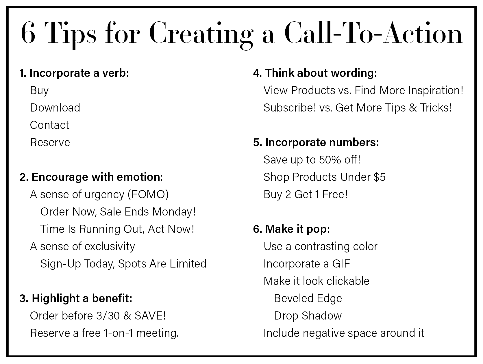
To help get you started, here are 6 tips for creating a CTA.

Remember, the easier you make it for your intended audience to take the next step, the higher the probability it will be acted upon. "The supplier’s purpose in their messaging should be to motivate me to pass their info/message onto my customer." adds Rector. "So their question needs to be, what can I send my customer, who is extremely busy, that will get their attention, make it worth their effort to share, and will make it easy for them to share? I receive hundreds of supplier ads a day (I actually have 1,211 unopened emails with many of them ads) so if a supplier ad doesn’t catch my attention immediately it will get deleted."
Take a look at your flyers, are you providing value and instructions on what to do or are you just sharing images and pricing without a call-to-action? If you're the latter, give CTAs a try! If you already include them, good for you! Now, how can you make them even better?
I’ll see you next month for a discussion on design/video apps vs creatives.
Jessica is the Art Director at PromoCorner and has been in the promotional products industry since 2010. With a degree in Graphic Design, she has been working in Marketing since 2006 creating advertising of all sizes; from social posts to billboards. Jessica shares her passion for design in her monthly blog, Designer Patch. She can be reached at
jessica@promocorner.com.