To add color or not to add color, that is the question. Well, at least it is for this blog post. Today, I want to focus on why you should take a little extra time to think about the colors you choose when creating a flyer.
Yes, colors are pretty, but it’s important to put some thought into them since they are the supporting characteristics of a flyer.
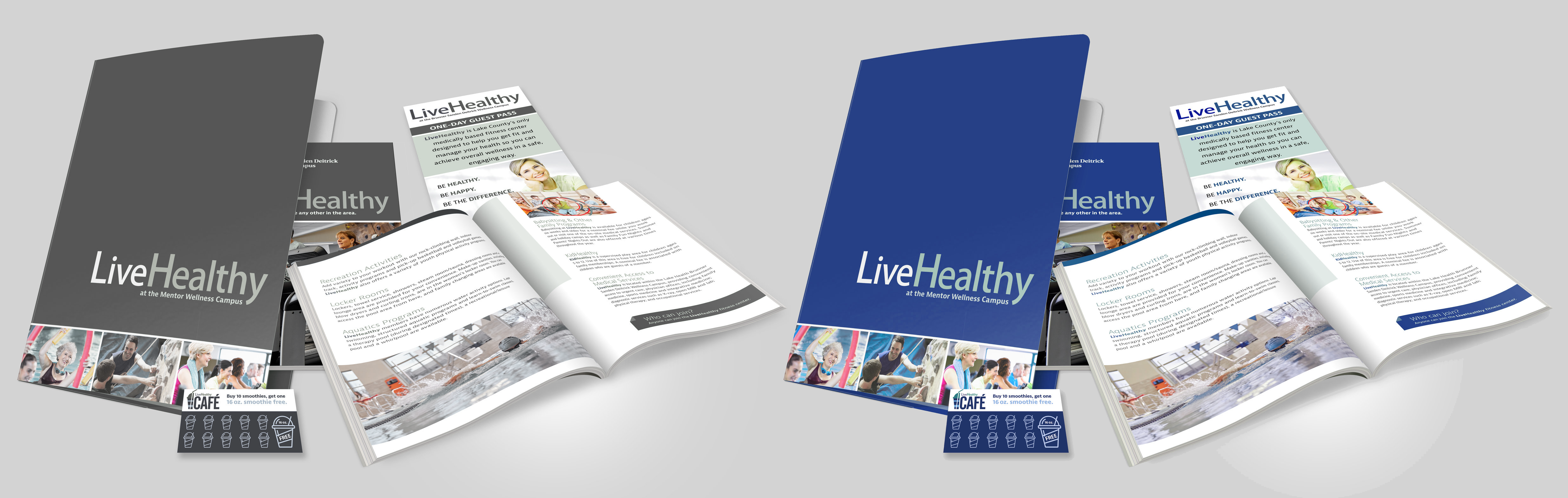
So, what the heck does that mean? Well, in graphic design, the primary purpose of color is to convey emotion. This may sound a little bizarre, but it’s true. Think back to when you were in elementary school, what did you think when you saw the color red, what about when you saw yellow? For me, it was “mean” and “happy”. In technical terms, this is Color Theory, “how humans perceive color … the messages colors communicate …” (source: 99designs). Take a look at the examples below. The left is showing a healthcare flyer using dark colors while the one on the right is using light colors. Which do you think works to convey the emotion of health and care?
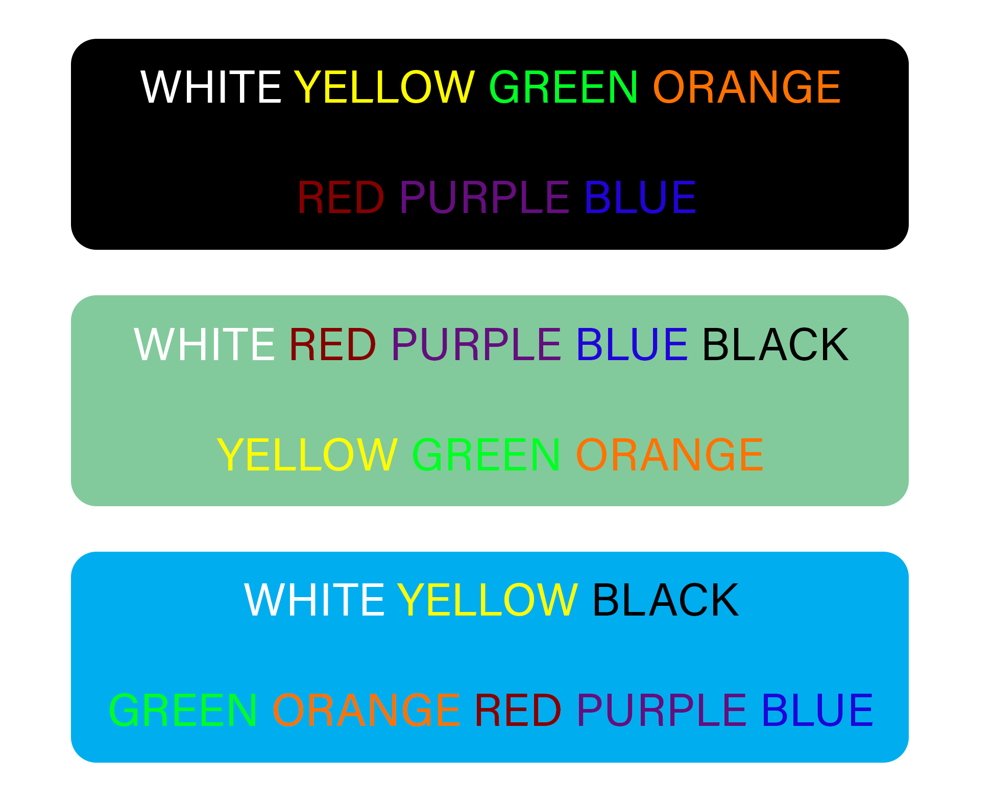
Another important consideration when choosing color is readability. If the recipient can’t read the text on your flyer then what good is it? The examples below show how you can convey the same emotion while being mindful of the contrasts colors play with each other.
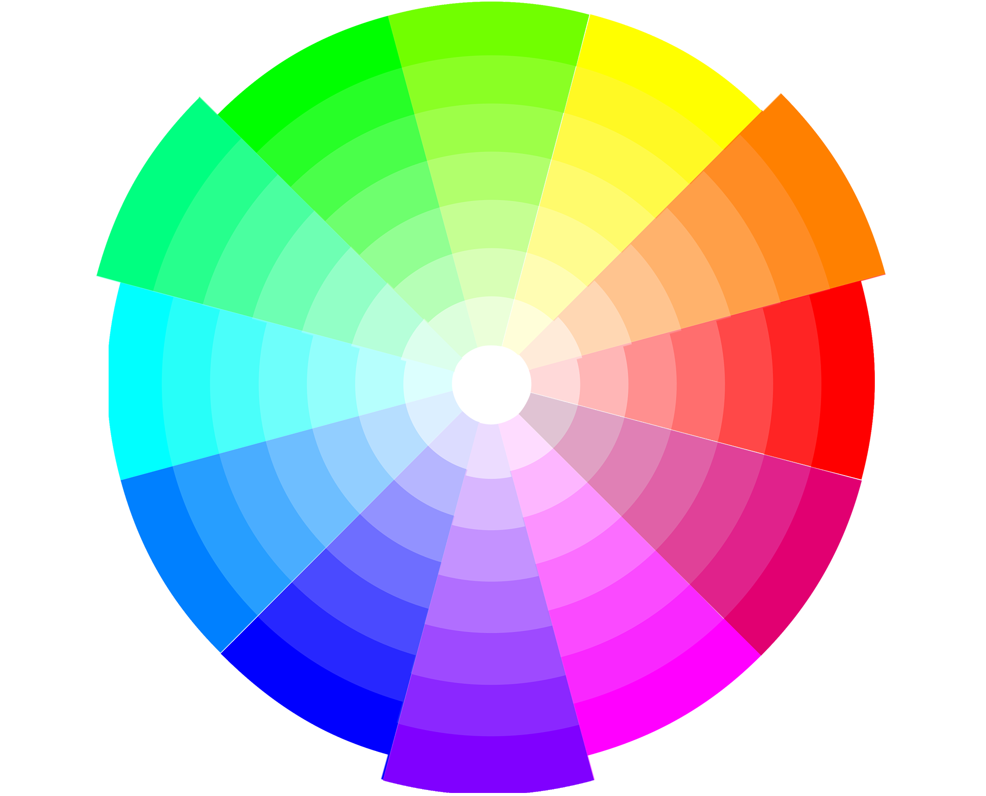
Now that we have these two important color rules down, how do we pick our colors? The best way is to turn to the color wheel, find a color that conveys your mood, and pick a scheme that creates readability and cohesiveness.
Complementary - colors that are straight across from each other
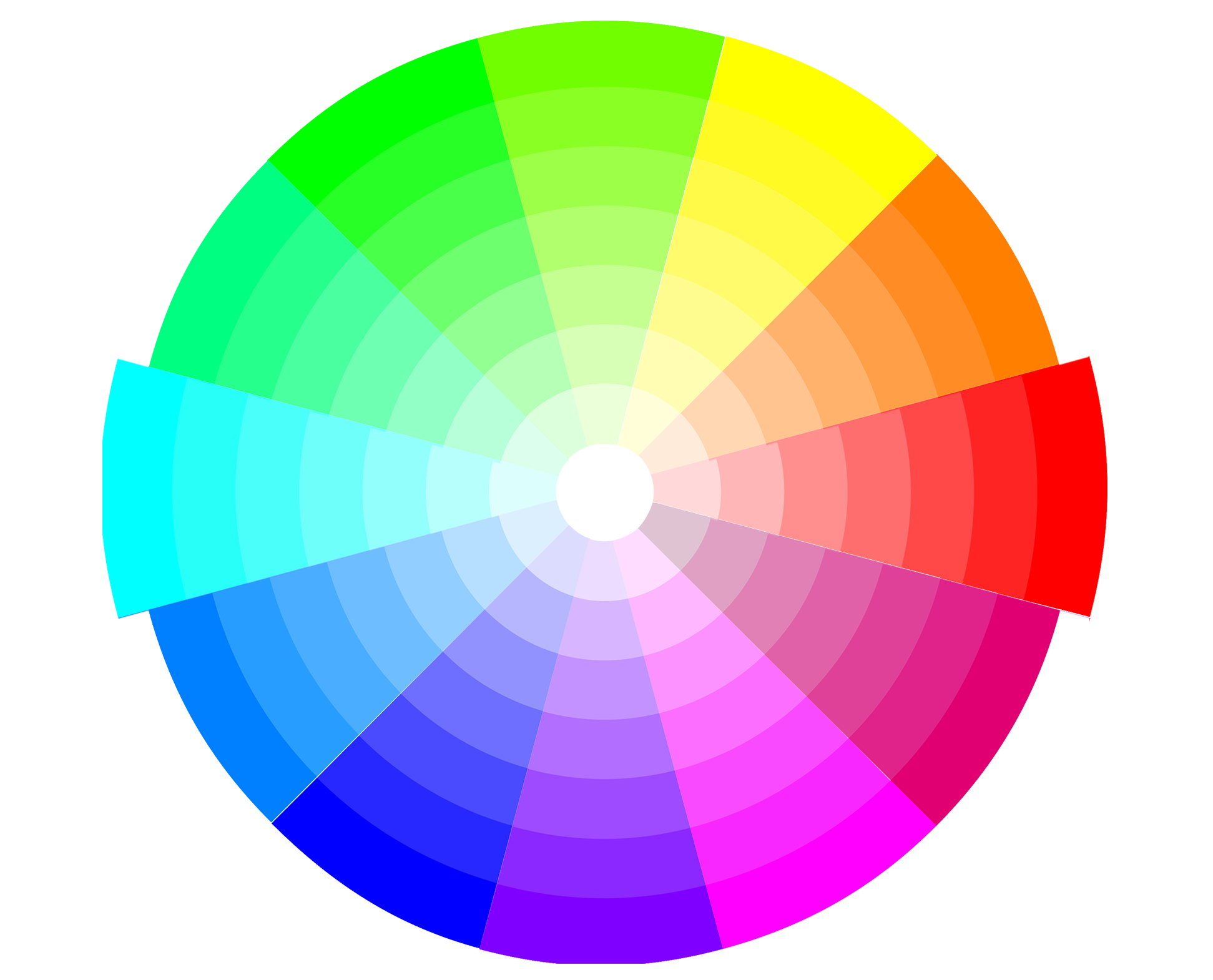
Analogous - colors that are next to each other
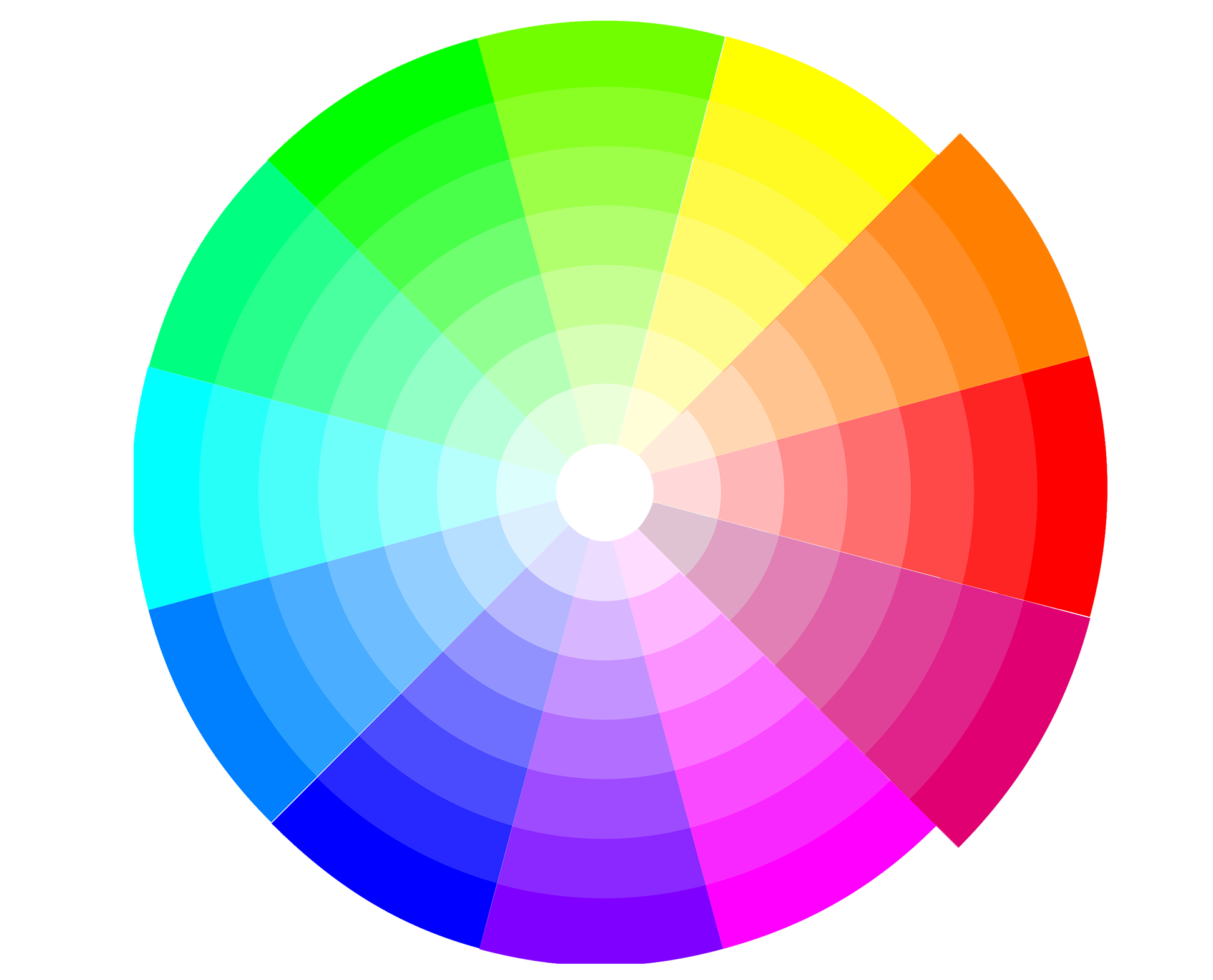
Triadic - colors form a triangle
Another option is to pick a color from the images you’re using in the flyer. This lends its hand to a very cohesive and intentional look.
I hope these simple guidelines help you take the leap into color! Stop by next month for some fun with fonts. Happy coloring!

Jessica is the Art Director at PromoCorner and has been in the promotional products industry since 2010. With a degree in Graphic Design, she has been working in Marketing since 2006 creating advertising of all sizes; from social posts to billboards. Jessica shares her passion for design in her monthly blog, Designer Patch. She can be reached at
jessica@promocorner.com.