So far in the “Stepping Up Your Email Game” series, we’ve learned the five key elements needed for a successful flyer and how we can simplify our existing flyers to be more impactful. But what if we want to create a new flyer layout like we’ve never done before? Where do we begin? Is it okay to look at other designs to get a jumping-off point?
Yes, looking for inspiration to help spark your creativity is normal. I have a B.F.A. in Graphic Design, have been working in the design field for 14 years, and still need help with inspiration every now and then. For me, it’s important to stay on top of design trends so I can make sure my work is fresh and offers the most value to those I work with.
This reminds me of a quote from the late Paul Rand, an iconic American Graphic Designer, “The public is more familiar with bad design than good design. It is, in effect, conditioned to prefer bad design, because that is what it lives with. The new becomes threatening, the old reassuring.”
To keep away from the familiar, I look for inspiration, which can be, quite literally, anything. From book covers to posters to graffiti to wine labels, design is all around us.
However, the easiest place to begin your inspiration journey is on the internet. Did you receive an email from a retail brand that had a compelling piece you absolutely loved? Create a folder in your emails called INSPO and save it there so you can easily find it when needed.
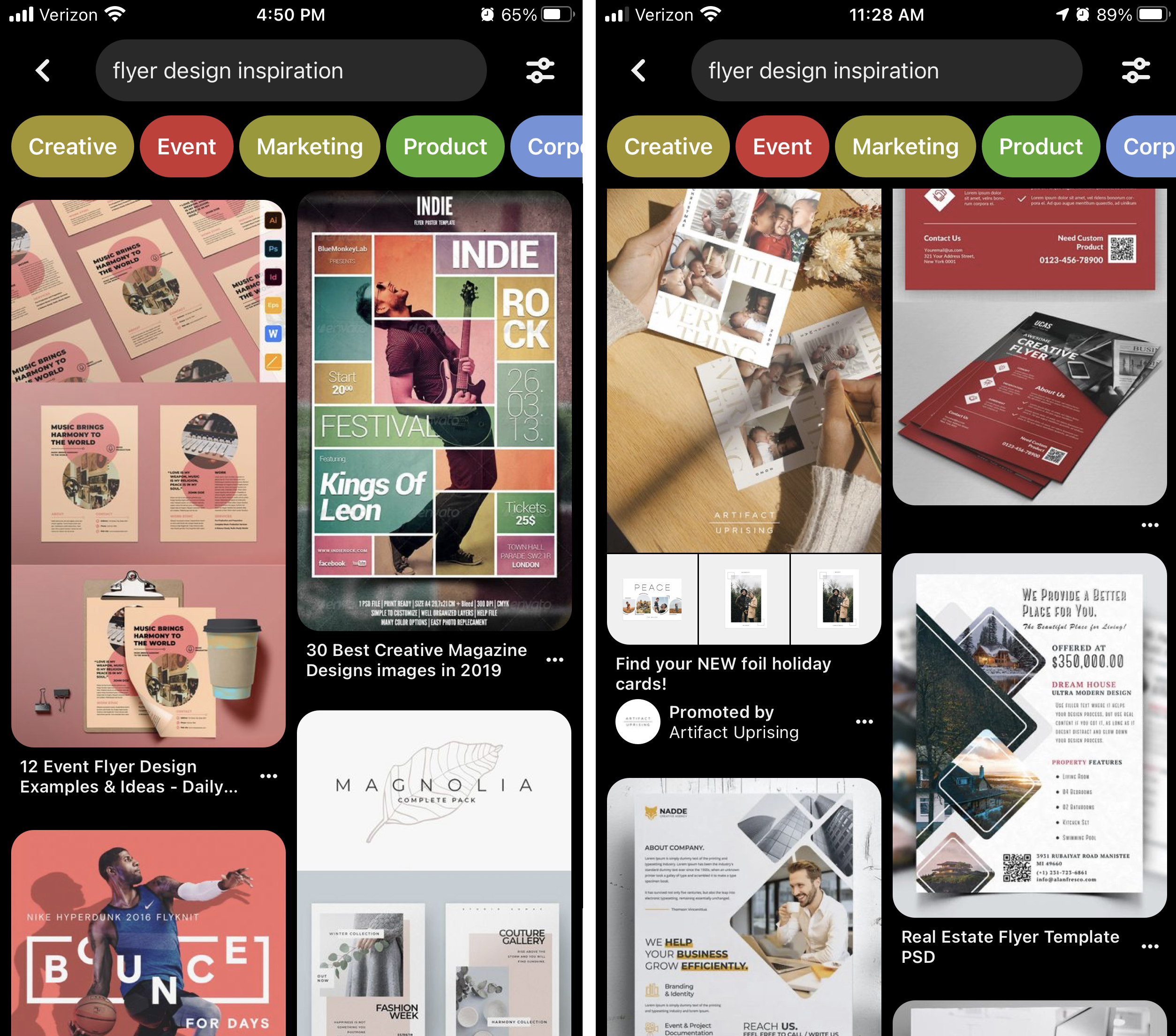
Another great place to search is Pinterest. As we all know, it’s a wonderful source of inspiration for recipes and OOTDs, but it’s also great for finding layouts and design. Create a designated INSPO board and pin away. Warning, this can turn into a rabbit hole.

As easy as it is to turn to the internet, not everything has to be digital. Walking through a store, like Target, can spark inspiration too. See something you like? Take a picture with your phone and create an album for reference.
Magazines are another fantastic source since they’re known for their creative layouts. Just rip out the pages you like and save them in a folder. If you’re not subscribed to any, keep your eyes open for subscription sales. (I keep getting ads in my IG Feed for The New Yorker - 12 weeks for $6 plus a tote - yay for that promo bonus!).

If you prefer keeping all of your inspiration in one spot, take screenshots of those emails and Pins, download your photos, and scan in (or take a pic of) the torn out pages, and save everything in one folder on your computer (or in the cloud).
Now that you have your inspiration, start breaking it apart. Play Dr. Frankenstein and take only the pieces that will enhance your design. Remember, these are just references to spark an idea, help you step outside of your comfort zone.
I would love to know where you turn when you need a little design inspiration and hope to see you next month when we discuss the importance of color. Happy searching!
Jessica is the Art Director at PromoCorner and has been in the promotional products industry since 2010. With a degree in Graphic Design, she has been working in Marketing since 2006 creating advertising of all sizes; from social posts to billboards. Jessica shares her passion for design in her monthly blog, Designer Patch. She can be reached at
jessica@promocorner.com.