To stay on trend with my end-of-year blogs, this month we’re going to be looking at Graphic Design trends for 2025.
ARTIFICIAL INTELLIGENCE (AI)
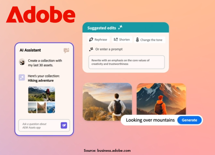
Just like this year (2024), AI isn’t going anywhere, especially as an assistant. We can drastically reduce the time repetitive tasks like resizing images, removing backgrounds, even correcting colors by handing it off to AI. It’s also helpful to use when you’re in a creative rut. Let it generate layouts or color palettes as a jumping off point to reignite your creativity.
How To Use
Time Saver - Use to help save time on repetitive tasks
Aide - Keep your creativity forefront while having AI act as a resource
TYPOGRAPHY
We’ll be seeing other trends listed below taken into consideration when working with text next year. Dynamic type (text that can change or animate) will continue to grow in popularity as it’s a great way to have fun by enhancing a design, but we can’t forget about the importance of legibility. If your website, ad, packaging, etc can’t be read then what’s the point? Also keep in mind inclusivity. Not everyone can read complex fonts or harsh color-on-color text or even thin/small type. Don’t let your message get lost for the sake of a dramatic design.
How To Use
Legibility - Use creative typefaces sparingly to avoid legibility issues
Creativity - Step out of your Helvetica comfort zone

ABSTRACT DESIGN
The push towards abstract isn’t going anywhere - adding fluidity to your designs with organic and asymmetrical shapes helps guide the eye where you want it to go. The trend for 2025 is the addition of depth through layering and texture.
How To Use
Balance & Composition - Make sure it serves a purpose instead of just filling space
Consistency - Keep a consistent style and color scheme to avoid looking disjointed
MAXIMALISM & MINIMALISM
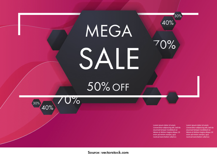
Yep, this one is contradictory and balancing the two may seem difficult. Pull elements from maximalist designs - bold colors, texture, and layering - and combine them with elements of minimalist design - increased use of negative space, clean lines, and subtle gradients - to create unique designs. You can create this by using strong typography in a bright color as a header or a simple oversized image that is the focal point.
How To Use
Focal Points - Build around your key points to highlight important information
Balance - Keep the design clean but utilize a bold color or texture for interest
INCLUSIVITY
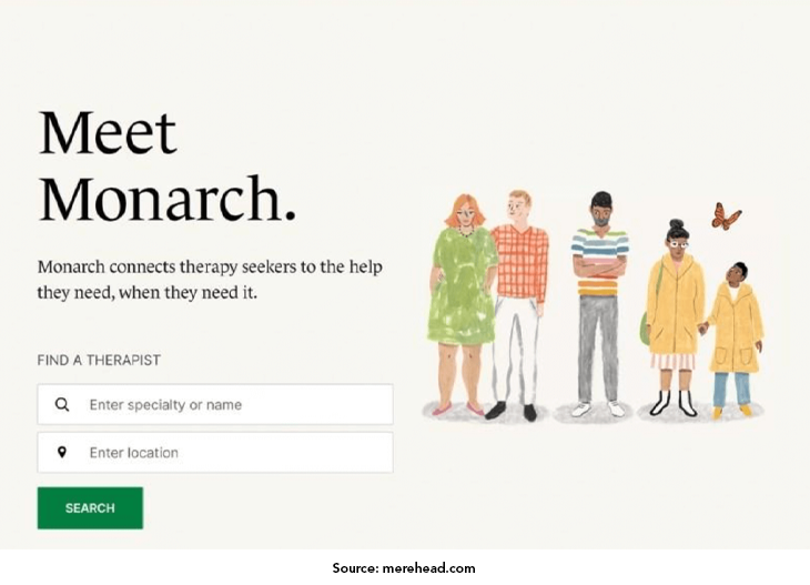
As mentioned in my 2023 trends article, inclusivity should be the norm, not a trend. That being said, it is good to see it is being focused on again. Not only is it important to follow accessibility guidelines, but big brands are trying to resonate with a more diverse audience through the adoption of inclusive color schemes and imagery. “By embracing inclusivity and accessibility, brands can build stronger connections with their audiences and demonstrate their commitment to social responsibility.” (loungelizard.com)
How To Use
Accessibility Guidelines - Ensure your brand is accessible to a wider audience
Diversity - In colors and images to showcase your commitment to inclusion
RETRO RETURNS
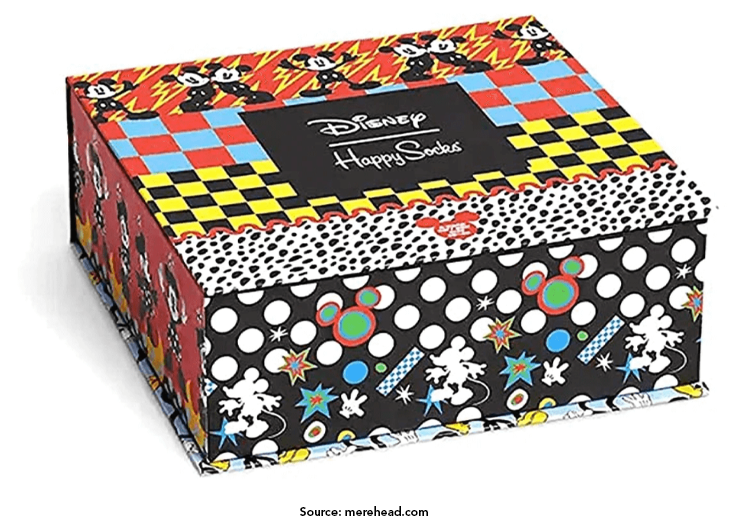
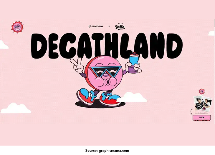
This is a trend that never seems to go away but is always changing. Pulling inspiration from the past has always been popular in fashion, music, and design; it’s just a matter of what era we’re looking back on. For 2025 we return to the 70s, 80s, and 90s to pull color schemes and aesthetics, but modernize to make everything clean and sophisticated. Pulling from elements listed above, retro designs will have more depth by incorporating textures and layered effects.
How To Use
Blending - Take retro elements and bring them up to date with modern designs
Depth - Utilize textures and layered elements for a more dynamic look
SUSTAINABILITY
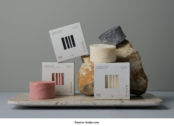
We touched on this trend last year with the use of recycled papers and eco-friendly inks and dyes, but this year focuses on natural textures (digital or physical) and earthy elements in a sophisticated and contemporary way which allude to a reconnection with nature. While leaning into trends is fun, for this one it’s important to avoid greenwashing.
How To Use
Colors - Utilize colors from nature like mossy greens, terracotta, ocean blues
Audience - Suitable for eco-friendly and sustainable brands
If you’re curious how these trends differ from the past three years, check out my previous blogs covering 2024 Trends, 2023 Trends, and 2022 Trends.
Jessica is the Art Director at PromoCorner and has been in the promotional products industry since 2010. With a degree in Graphic Design, she has been working in Marketing since 2006 creating advertising of all sizes; from social posts to billboards. Jessica shares her passion for design in her monthly blog, Designer Patch. She can be reached at
jessica@promocorner.com.