Typography’s purpose is to tell your message. Your purpose is to make it look good and legible.
Sure we all like a dramatic and unique typeface every now and then, but can your readers decipher what it says? After all, what’s the point in looking fancy if nobody can read your message. And if nobody can read your message then nobody wants to do business with you.
But, before I dive deeper into this subject, it’s time for a little Graphic Design 101.
Typeface vs Font
- Typeface is the design of lettering.
- Font is the variation of the typeface; extra bold, bold, regular, light, italic, condensed, etc.
Now back to your regularly scheduled blog…
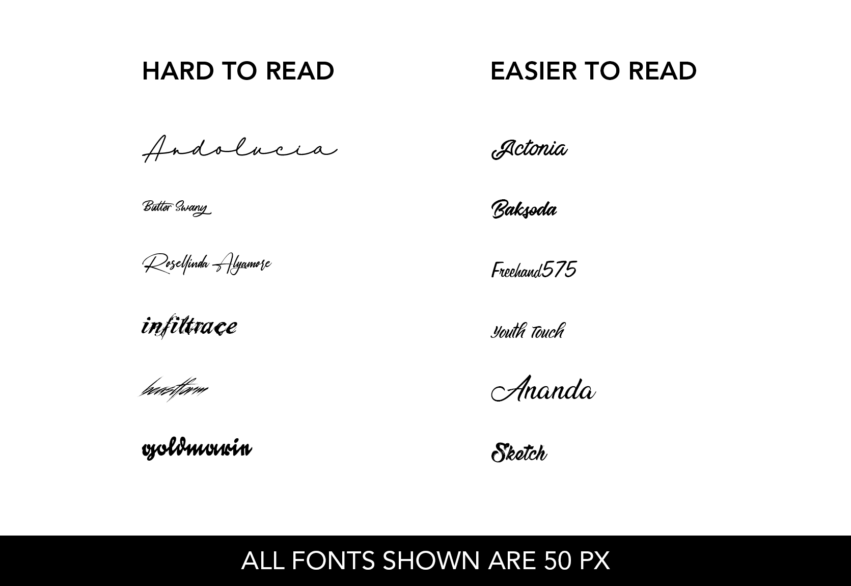
When you’re choosing your typeface there are three important aspects to keep in mind: Readability, Hierarchy, and Tone.
Readability
This one is obvious. You want to choose a typeface that is clear and easy to read. This, however, doesn’t mean it can’t be a bit “whimsical”. There are plenty of script typefaces out there that are easy to read. You can also play with various weights, such as bold vs light or condensed vs extended.
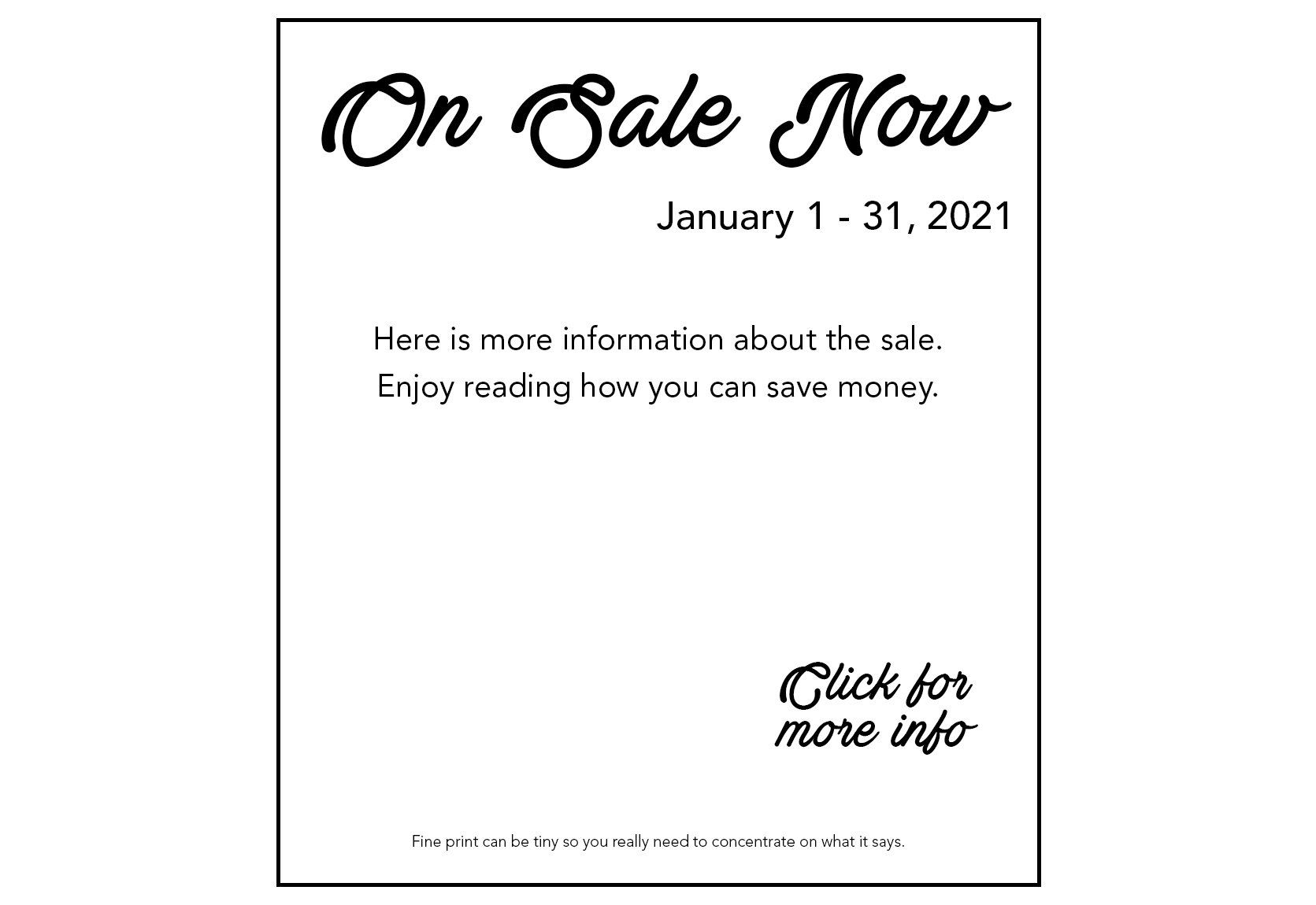
Hierarchy
As discussed in my second blog post, How to Simplify Your Flyers While Increasing Impact, use visual hierarchy to organize the information of your flyer by importance. Make your title is the largest type or the boldest or a complete opposite typeface than the rest of your flyer.
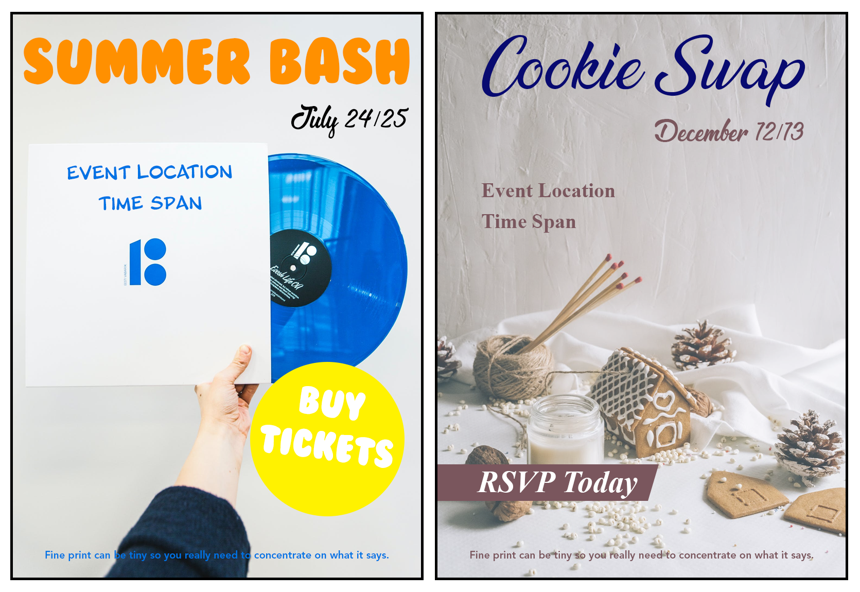
Tone
Depending on what your content is about, you can set a tone with your typeface. For example, if you’re working on something for the summer, we tend to see “bubble”/rounded and bold fonts whereas “fancier” script or serif typefaces lend themselves to the Holiday season.
A small rant, if you will.
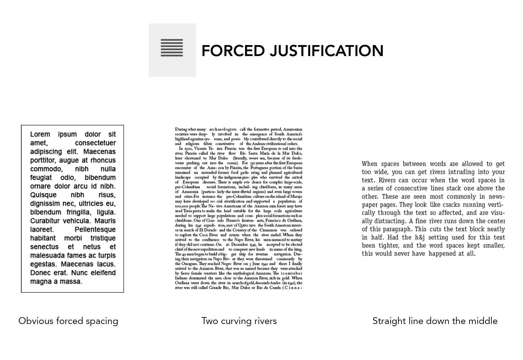
Please stop using forced justification, it doesn’t look good and makes Graphic Designers around the world sad. Yes, having your body of text justified helps to retain attention more so than left-aligned, but clicking the Align > Justify button isn’t the way to do it. That evil little button creates rivers in your text (a glaring path of negative space amongst your words that runs from top to bottom and stands out like a sore thumb) that makes reading choppy. If you want your text to be justified then you need to take the time and adjust the kerning to avoid any funky spacing. #EndRant
With these three key points (and bonus rant), you can now better guide and inform your readers while holding their attention. I’ll see you next month to discuss free domain photography sites. Happy typing!
Jessica is the Art Director at PromoCorner and has been in the promotional products industry since 2010. With a degree in Graphic Design, she has been working in Marketing since 2006 creating advertising of all sizes; from social posts to billboards. Jessica shares her passion for design in her monthly blog, Designer Patch. She can be reached at
jessica@promocorner.com.